UX case study for log in and sign up buttons

If you're like me, then you've tried to log into a website and got confused with
which button to click. The placement, terminology and styling often throws me
off. For authentication we often see log in, sign in and for registration
words like sign up or create account.
In this case study, I want to determine which terminology should be used as default for authentication and registration buttons. Then, identity common patterns of placement for these buttons when viewed on a personal computer (monitor) not a mobile device. We will look at 10 common social media websites and 10 web developer websites and see what they do.
Social Media Sites
| Url | Auth | Registration | Placement |
|---|---|---|---|
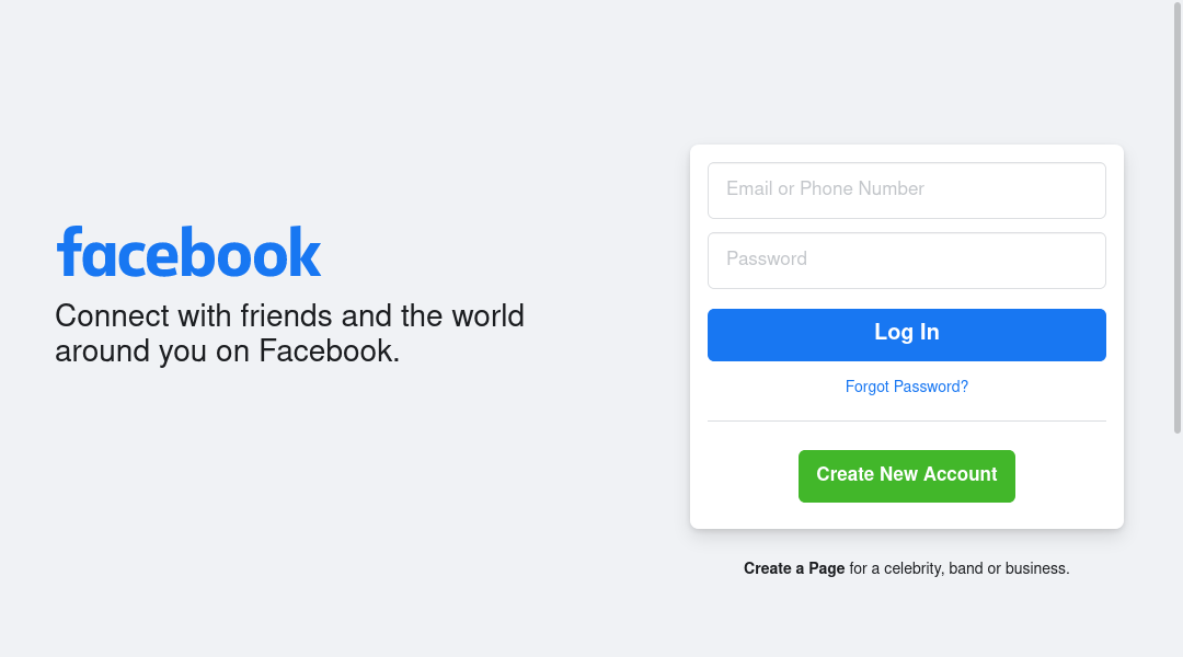
| facebook.com | Log In | Create New Account | Landing page right |
| twitter.com | Sign In | Sign Up With ... | Landing page right |
| linkedin.com | Sign in | Join Now | Landing page left; Nav top right |
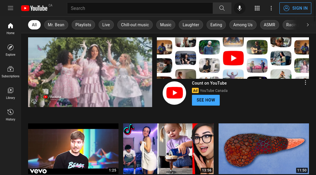
| youtube.com | SIGN IN | Create Account | Nav top right; Registration is hidden behind Auth form |
| pinterest.com | Log in | Sign up | Nav top right |
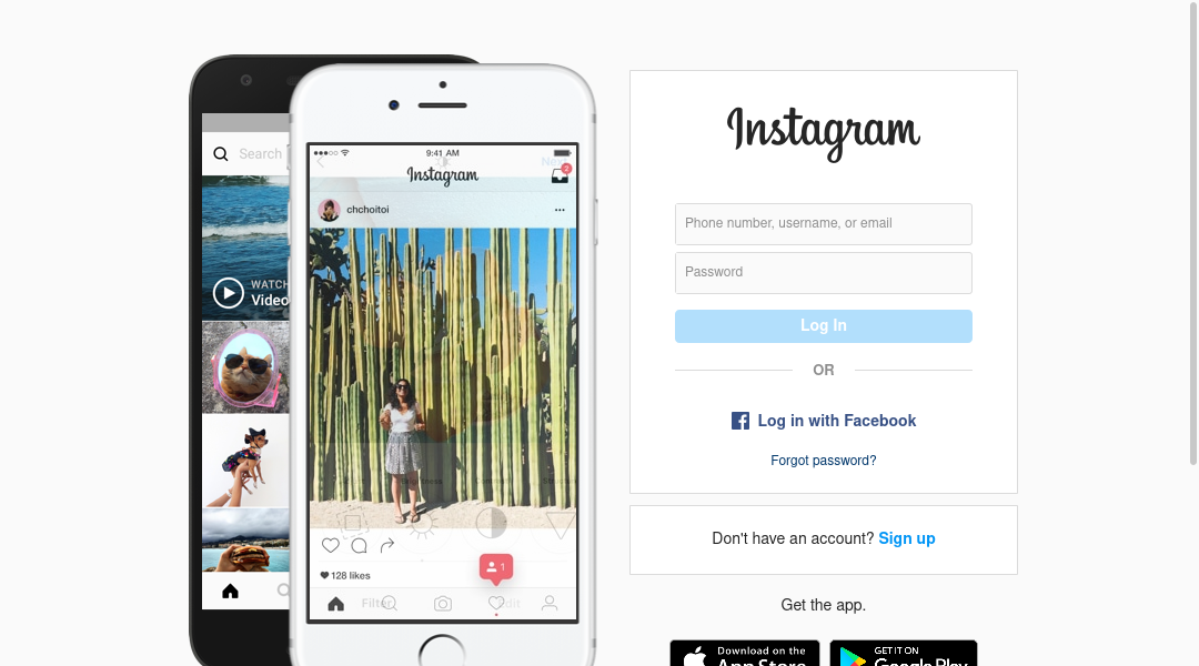
| instagram.com | Log In | Sign up | Landing page right |
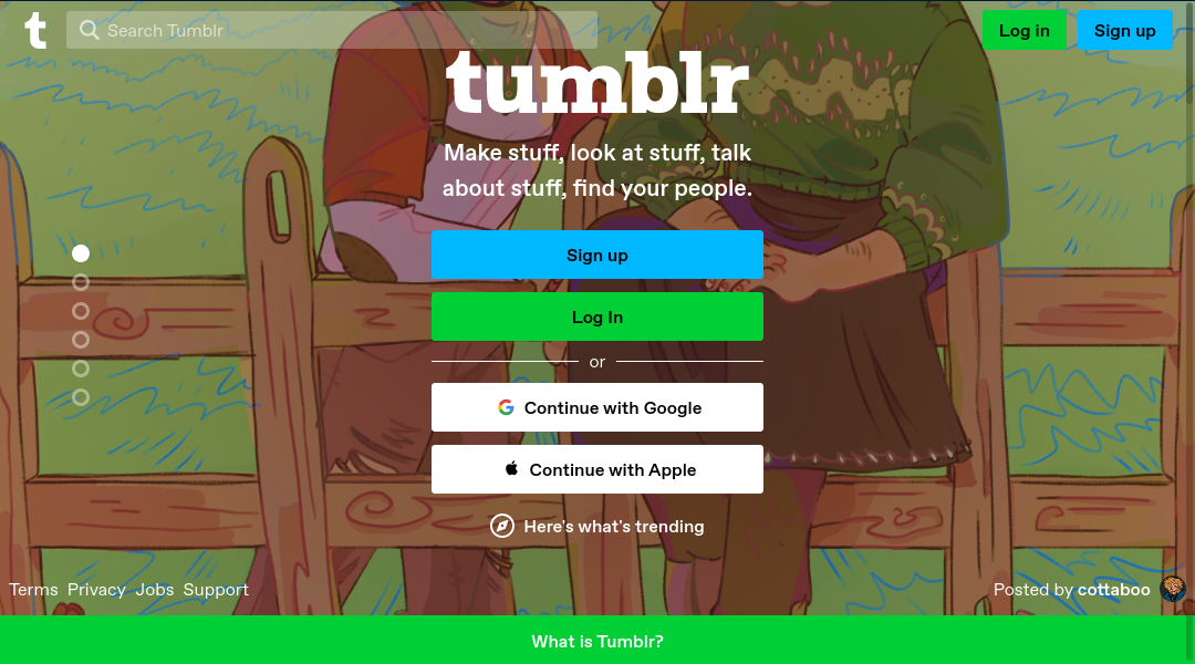
| tumblr.com | Log in / Log In | Sign up | Landing page center; Nav top right |
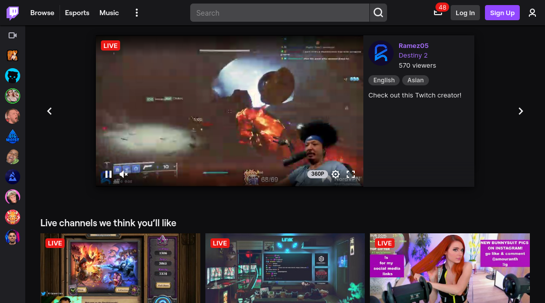
| twitch.tv | Log In | Sign Up | Nav top right |
| flickr.com | Log In | Sign Up / Start for free | Nav top right |
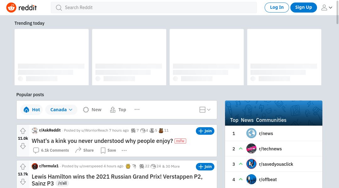
| reddit.com | Log In | Sign Up | Nav top right |
Developer Sites
| Url | Auth | Registration | Placement |
|---|---|---|---|
| github.com | Sign in | Sign up | Nav top right |
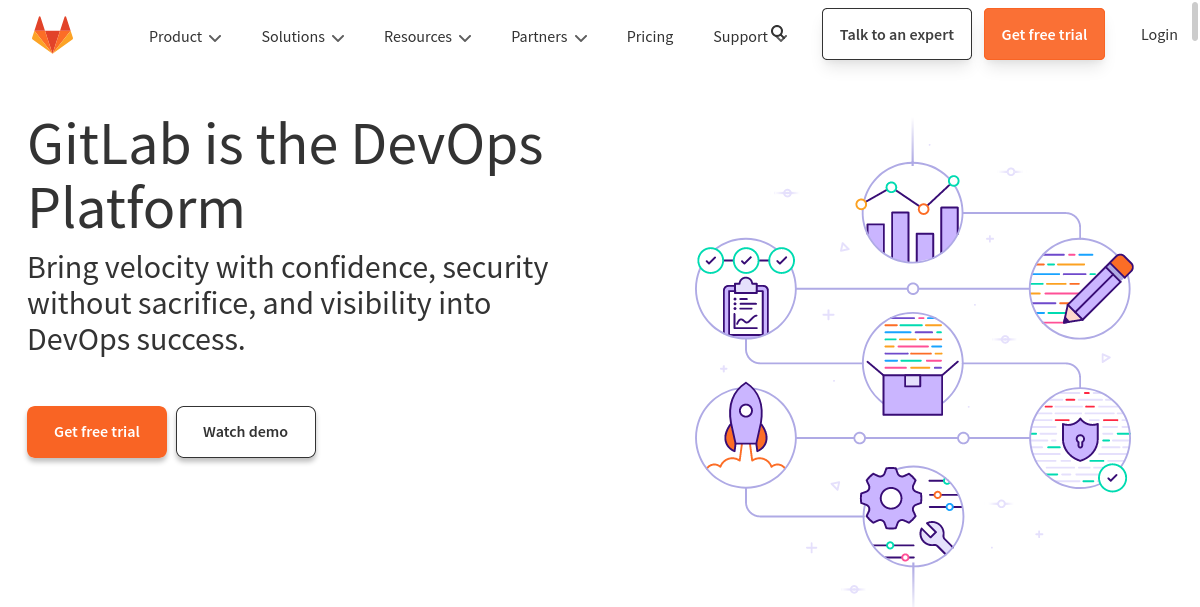
| about.gitlab.com | Login | Get free trial | Nav top right |
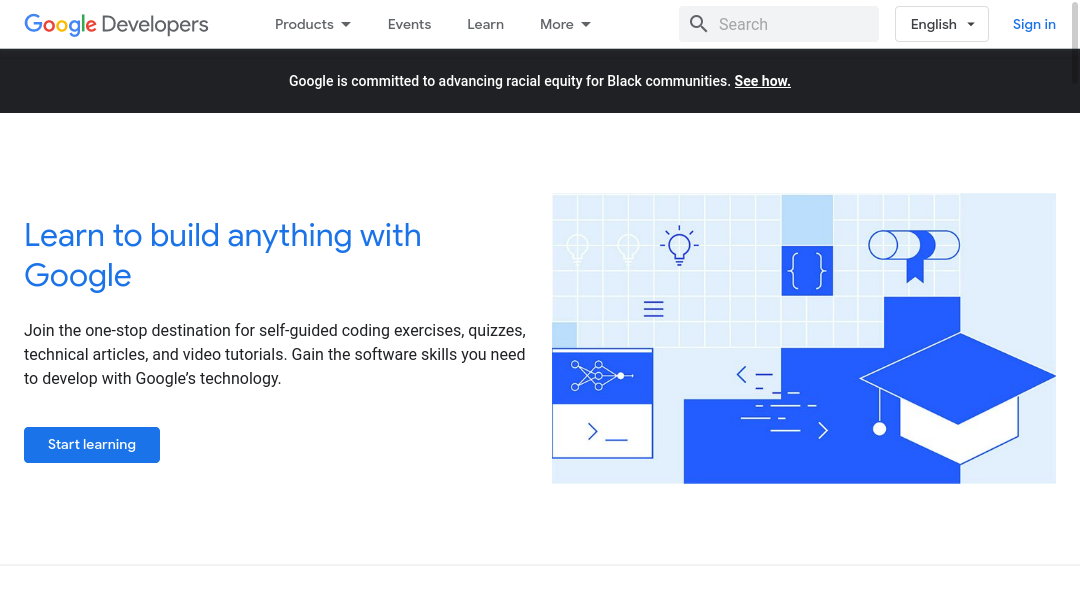
| developers.google.com | Sign in | n/a | Nav top right |
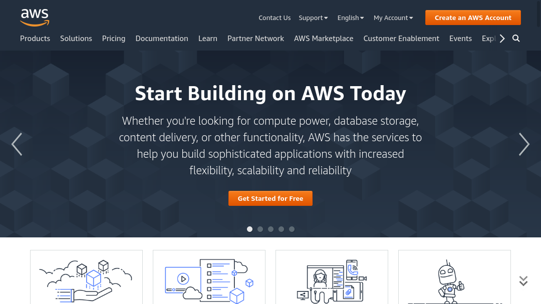
| aws.amazon.com | My Account | Create an AWS Account | Nav top right |
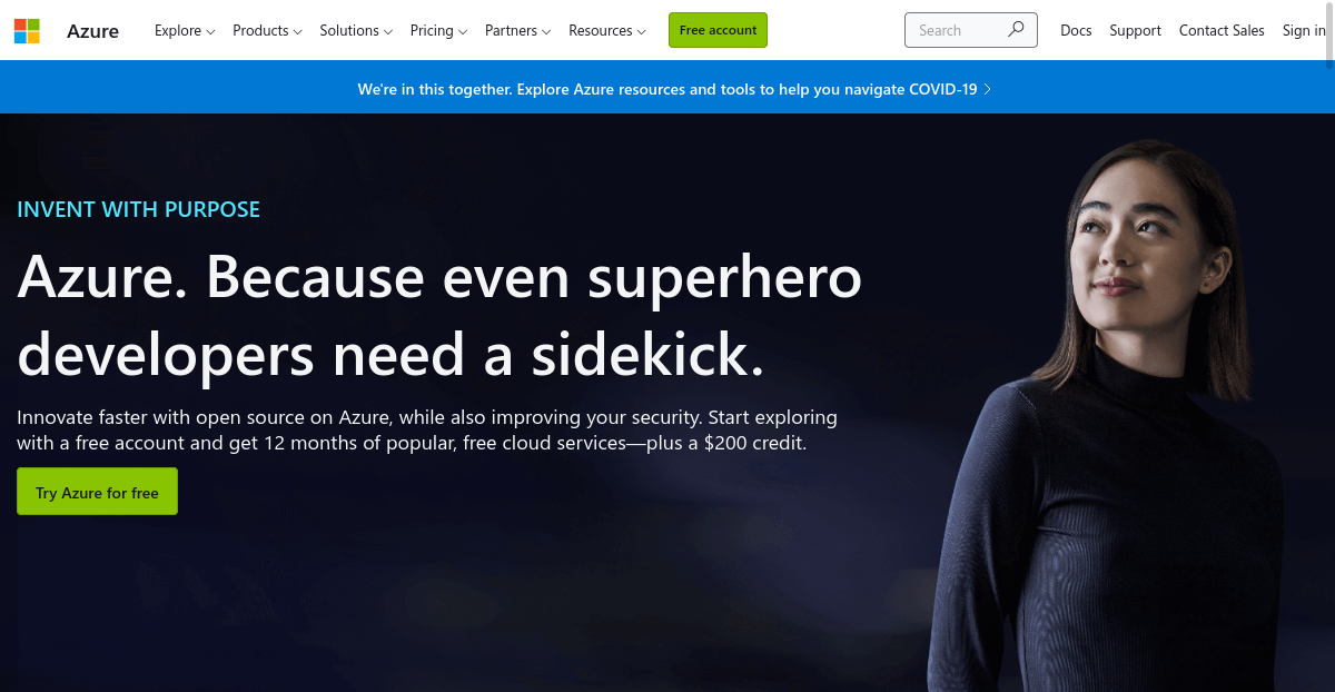
| azure.microsoft.com | Sign in | Free account / Try Azure for free | Nav top right |
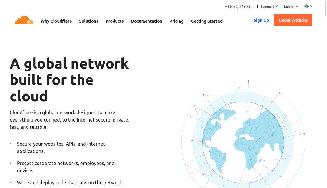
| cloudflare.com | Log In | Sign Up | Nav top right |
| digitalocean.com | Log In | Sign Up | Nav top right |
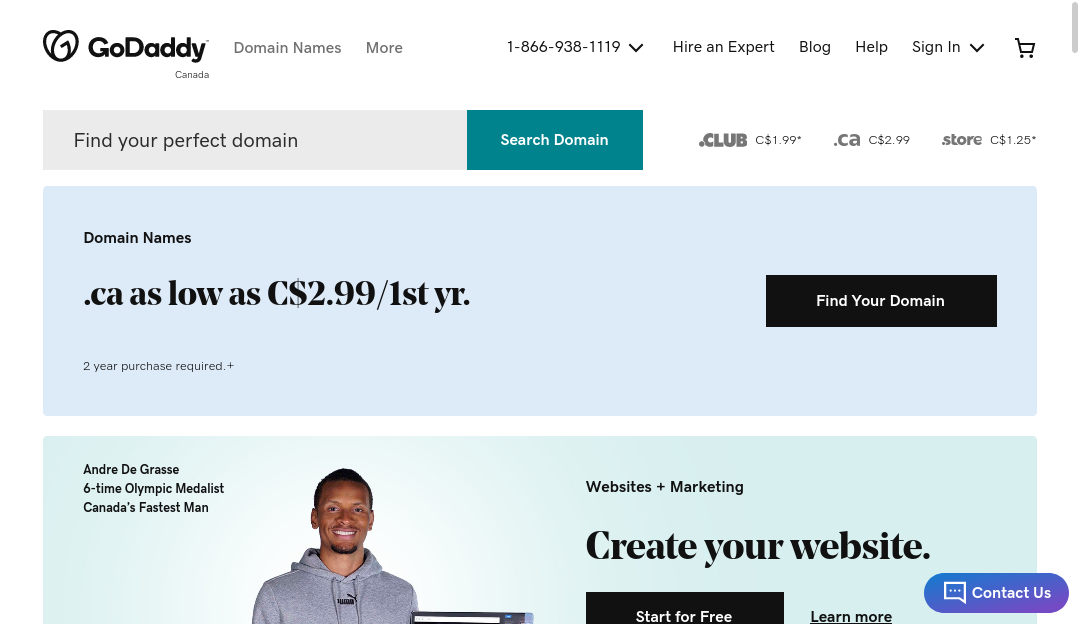
| godaddy.com | Sign In | n/a | Nav top right |
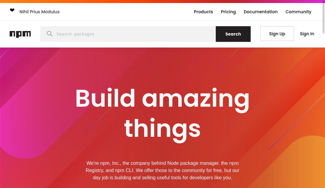
| npmjs.com | Sign In | Sign Up | Nav top right |
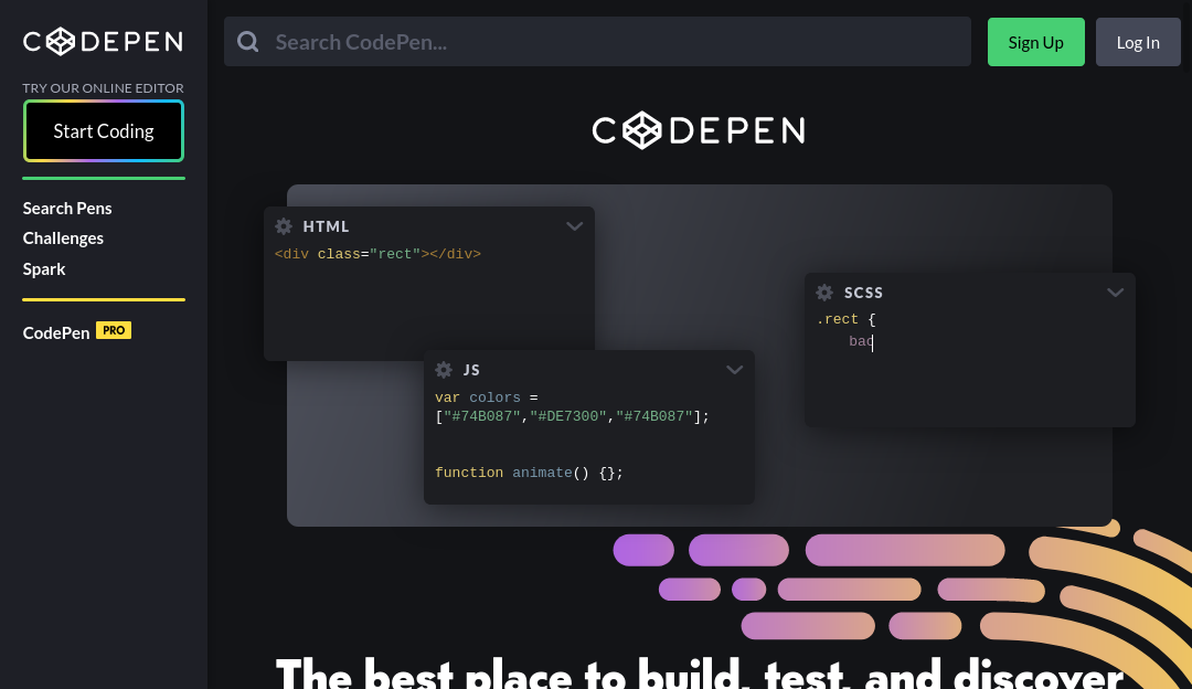
| codepen.io | Log In | Sign Up | Nav top right |
Conclusion
Authentication
Log inor variations - 11Sign inor variations - 8
Registration
Sign upor variation - 12Create ...or similar - 3- remaining terms are all unique
It appears that the results for authentication lean slightly towards the wording
Log in while Sign in is a very close second option. For registration,
Sign up is the clear winner. Other options vary, but Create ... seems to be
the next most viable.
If Sign up is chosen for registration, then it would be logical to avoid
Sign in because they are so similar. Although styling the buttons differently
may help distinguish Sign in & Sign up, they only differ by one letter so it
is easy to mistake.
As for registration, most occurences of Create ... happen when the action is
displayed in the Landing page, not the nav. Since the nav often contains many
items, using Create ... may take up too much horizontal space. Having succinct
terms for the nav would reduce visual clutter.
Rules
- use
Sign Upfor registration by default. - use
Log Infor authentication by default. - accent the registration button
Sign Upwith a border or background color. - position
Log InandSign Upbuttons on the top right of the page. Preferably on the top nav bar. - position
Log InbeforeSign Up. - using
Create Accountor a variation is permitted for registration if there is enough horizontal space. Preferably on a landing page form. - using
Sign Inis only permitted for authentication ifSign Upis not used for registration.
Screenshots


Youtube

Tumblr
Twitch
Flickr

Developer Sites
Github

Gitlab
Google Developers
Amazon Web Services (AWS)
Microsoft Azure
Cloudflare
Digital Ocean

Go Daddy
NPM
Codepen